Machine Learning
What is Mean Squared Error (MSE)?
October 17, 2024
0

Introduction

When working with machine learning models, especially in regression tasks, it’s crucial to evaluate how well your model is performing. One of the most commonly used metrics for this purpose is Mean Squared Error (MSE). In this blog, we’ll break down what MSE is, why it’s important, and walk through a simple Python example to help you calculate and visualize MSE.

What is Mean Squared Error (MSE)?

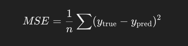
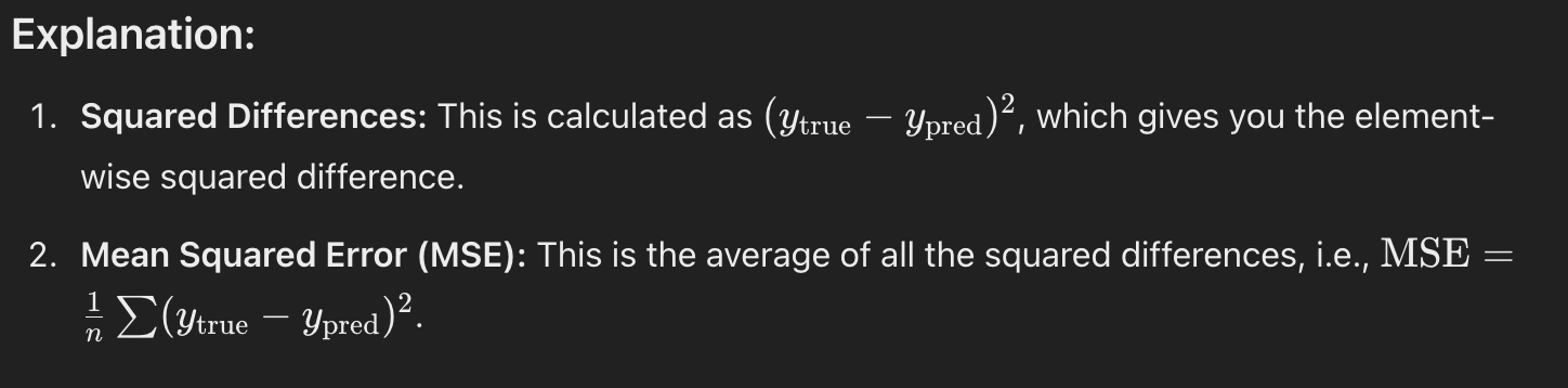
Mean Squared Error is a metric used to measure the average of the squares of the errors between predicted values and actual values. Essentially, it shows how far the model’s predictions are from the true values. The formula for MSE is:

Mean Squared Error (MSE): The cost function for linear regression. It calculates the average squared difference between the predicted and actual values.

  • Tip: Square the errors to make sure negative and positive differences don’t cancel out.

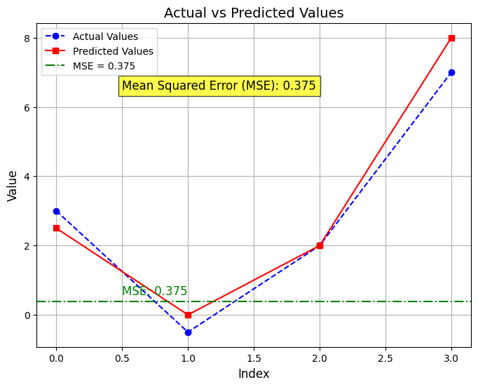
Here’s a sample Python code that demonstrates how to calculate the squared difference between the predicted and actual values and then find the average of the squared differences (i.e., Mean Squared Error, MSE):


import numpy as np
import matplotlib.pyplot as plt
# Sample actual values (y_true) and predicted values (y_pred)
y_true = np.array([3, -0.5, 2, 7])
y_pred = np.array([2.5, 0.0, 2, 8])
# Step 1: Calculate the squared differences between actual and predicted values
squared_diff = (y_true – y_pred) ** 2
print(“Squared differences: “, squared_diff)
# Step 2: Calculate the average of the squared differences (Mean Squared Error)
mse = np.mean(squared_diff)
print(“Mean Squared Error (MSE): “, mse)
# Plotting the actual and predicted values
plt.figure(figsize=(8, 6))
plt.plot(y_true, label=”Actual Values”, marker=’o’, color=’b’, linestyle=’–‘)
plt.plot(y_pred, label=”Predicted Values”, marker=’s’, color=’r’, linestyle=’-‘)
# Highlighting the MSE as a horizontal line in the plot
plt.axhline(y=mse, color=’g’, linestyle=’-.’, label=f’MSE = {mse:.3f}’)
# Annotating the MSE on the graph
plt.text(0.5, mse + 0.2, f’MSE: {mse:.3f}’, color=’g’, fontsize=12)
# Adding the MSE value in yellow on the plot
plt.text(0.5, 6.5, f’Mean Squared Error (MSE): {mse:.3f}’, fontsize=12, color=’black’,
bbox=dict(facecolor=’yellow’, alpha=0.7))
# Highlighting the MSE in the title
plt.title(f’Actual vs Predicted Values’, fontsize=14)
# Labeling the axes
plt.xlabel(‘Index’, fontsize=12)
plt.ylabel(‘Value’, fontsize=12)
# Adding a legend to distinguish between actual and predicted values
plt.legend()
# Show the plot
plt.grid(True)
plt.show()

About author

ZERIN

CEO & Founder (BdBooking.com - Online Hotel Booking System), CEO & Founder (TaskGum.com - Task Managment Software), CEO & Founder (InnKeyPro.com - Hotel ERP), Software Engineer & Solution Architect

There are 0 comments

Leave a Reply

Your email address will not be published. Required fields are marked *